
As Chief Customer Officer for a senior living survey company, one promise I make to my customers is that our analysis of their survey data will allow them to clearly identify top opportunities to improve and grow their business.
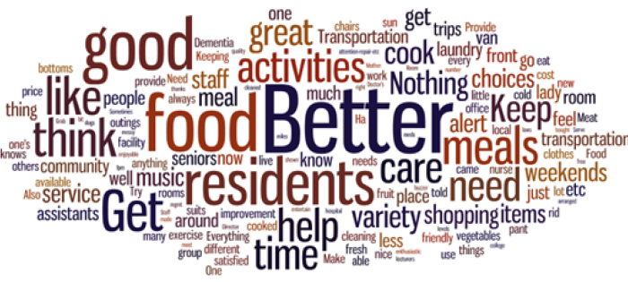
A new trend in customer survey reporting is to summarize customer comments with a word cloud. In case you haven’t heard, a word cloud is simply a collection of words clustered into a cloud-like shape. The most common words are shown in large, bold font and the less common words smaller and less bold. The idea is to give the reader a quick glance at the most common words customers use when providing comments on their survey. Word clouds are attractive and can be created quickly, but they have serious shortcomings when used as a tool for identifying actionable insights from survey data.
Principle 1: Your Data Should Tell A Story
 When it comes to presenting the results of a survey, there are two basic principles we strive to uphold. First, we strongly believe that survey data should tell a meaningful story. Customer comments about needed improvements and things done well are some of the most important information provided on feedback surveys, yet they are often treated as a secondary source of information.
Since it is hard for executives at even relatively small companies to read through and make sense of all the comments on their surveys, it is important that research companies provide a clear picture of customer sentiment. Computers are rather poor at understanding the meaning of language, so as part of our analysis we use human coders to read through all customer comments and code them into themes. The themes are presented in bar charts with the most common themes at the top and the least common themes at the bottom. This approach allows our customers to see the relative frequency of their customers’ concerns and accolades at a glance.
In contrast, a word cloud often utilizes a simple count of the words in a body of text. This presents some obvious difficulties. Imagine trying to understand a book with a word count. You might have some idea about what the book is about (in the book Moby Dick, the term “whale” would likely be prevalent), but a book report based on that word count would be sorely lacking compared to someone who had read the book and made note of the most important themes.
Principle 2: You Should Be Able To Dig Deeper
 The second principle we strive to uphold is that it should be easy for readers to dig deeper into their data. One way we accomplish this is by giving clients the ability to filter and sort their customer comments. As an example, if a client finds that dining is the most prominent improvement theme coming out of their customer comments, they can filter the comments by theme and sentiment to focus in on improvement suggestions strictly related to dining. This would be much more difficult to implement effectively with a word cloud where comments are not tagged by theme.
Word clouds are pretty but throw both principles of data storytelling out the window. Put best by Jacob Harris, senior software architect at The New York Times, “Prettiness is a bonus; if it obliterates the ability to read the story of the visualization, it’s not worth adding…” Mr. Harris also says, “Every time I see a word cloud presented as insight, I die a little inside,” a humorous yet resonating viewpoint.
Let’s Compare
Take a look at these two visualizations and the differences should be apparent. Both graphics depict 129 improvement suggestions made by residents of a senior living community:
WORD CLOUD
BAR CHART WITH FILTERED CUSTOMER COMMENTS

How is one to ascertain from the word cloud that almost one quarter of improvement suggestions are about dining? And further that 20% were actually positive comments about the community despite residents being asked to provide a suggestion for improvement? While word clouds are arguably more visually appealing, I think we can all agree that the bar chart is a much better choice for making strategic business decisions.
Bottom Line
The advantage of word clouds is that they are attractive and easy to create. The disadvantage is that they typically fail to give you the actionable insights you need to improve and grow your business.